 A few clicks of the mouse and a quick glance is all you need to see just how well biodiversity is doing in a given area. Two years in the making, NatureServe has a dynamic new online platform, the Biodiversity Indicators Dashboard, which analyzes and visualizes datasets, creating an easily understood view of the health of biodiversity in multiple spatial scales. It will also show decision-makers whether the steps they’ve taken to conserve areas are having the intended impact.
So far, the Dashboard has been applied for three high-value areas: the tropical Andes, the Great Lakes of Africa, and the Mekong River Valley. Once the prototype stage ends in December 2015, the Dashboard can be tailored for use anywhere in the world.
Toward the Aichi Targets
Four years ago in Aichi, Japan, the international conservation community took a seminal step toward addressing catastrophic losses in biodiversity all over the world. Nearly 200 nations that have signed onto the Convention on Biological Diversity are vowing to reach the 20 Aichi Targets by the year 2020.
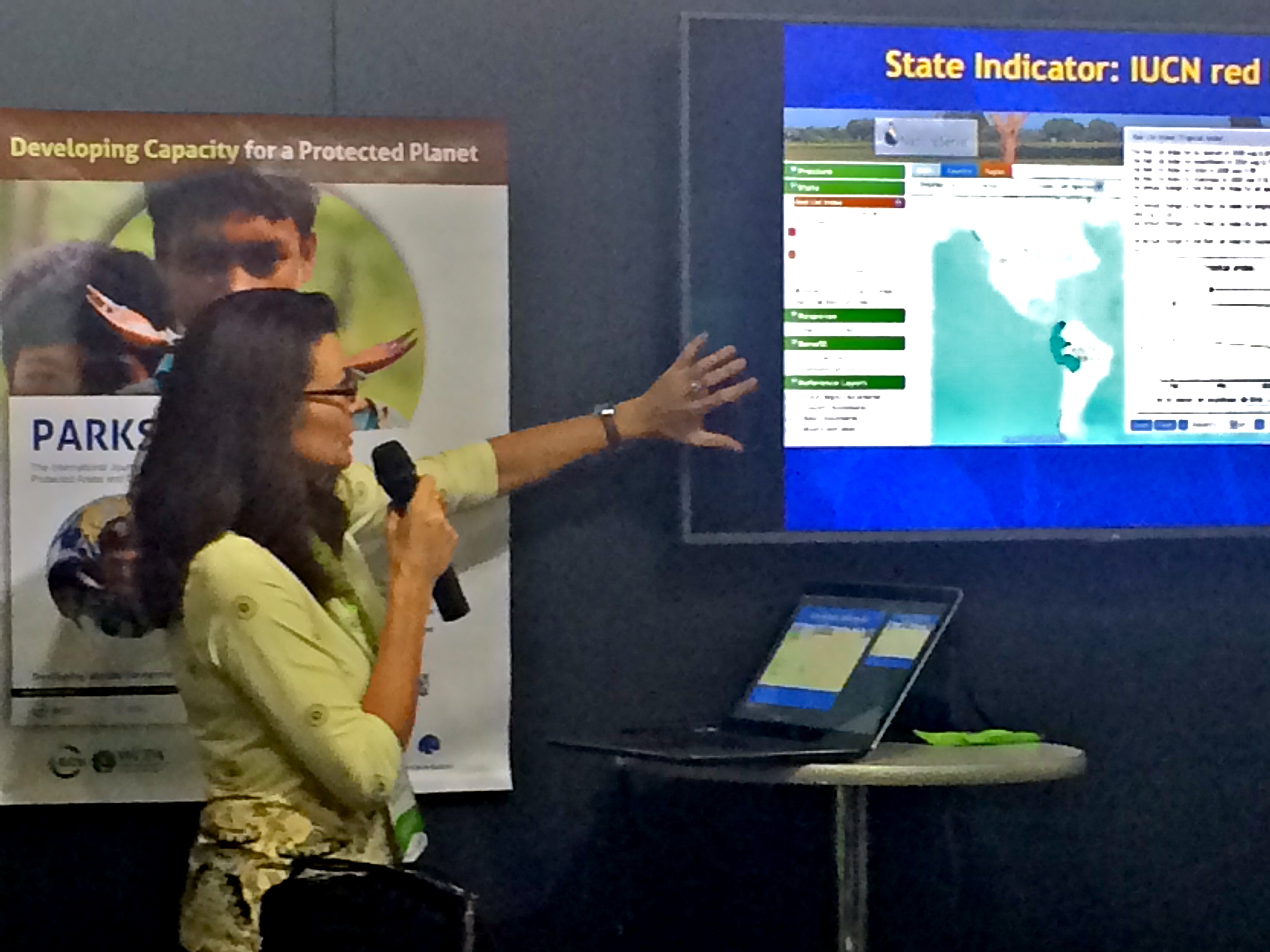
Conservationists have widely adopted a framework of “indicators” as the most effective way to measure progress toward the Aichi goals. NatureServe's Dashboard looks at biodiversity in terms of four of these indicators and breaks new ground in showing nations and institutions how far they have come in that regard:
- Pressure - reducing the threats and pressures on biodiversity
- State - maintaining and improving the state of biodiversity
- Response - conservation actions that attempt to curb the loss of biodiversity
- Benefit - harnessing the benefits that healthy biodiversity provides to human wellbeing
“The whole idea of measuring whether you’re having any impact is actually relatively new, and so is how to do it,” said Healy Hamilton, NatureServe’s Chief Scientist. “There are no other options that visualize data with respect to this model. We’re the first people to visualize biodiversity trend data in terms of that framework—and we do it in a way that you don’t need a PhD in GIS mapping. You just click a few things on and off, and boom, it’s right there: a snapshot of biodiversity that you can instantly understand.”
The Dashboard also offers a new perspective on biodiversity trends that does away with political boundaries that tend to have little environmental relevance.
“I think what’s most pioneering about the Dashboard is that we’re using the watershed scale as a spatial unit for understanding trends in biodiversity,” Hamilton said. “By downscaling global datasets to a watershed scale, you can understand large watersheds in their entirety, and you can compare how different watersheds within a country are performing. Using watersheds as a unit of analysis rather than national borders just makes more sense ecologically.”
An International Debut
Funded by the John D. and Catherine T. MacArthur Foundation, NatureServe began analyzing data in 2012 on species and ecosystems in three regions—the tropical Andes, the Great Lakes of Africa, and the Mekong River Valley in Southeast Asia—in which the MacArthur Foundation has invested millions of dollars to promote conservation. The effort draws from datasets produced by an array of the world's top conservation groups, including the IUCN, the World Conservation Monitoring Center, BirdLife International, and Conservation International.
After years of work, the Dashboard made its debut in 2014 at the World Parks Congress in Sydney, Australia, a once-per-decade convention on protected areas across the globe. The Dashboard's two demonstrations at WPC sparked particular interest, Hamilton said, from attendees who wanted to know if their data could be included or whether the Dashboard could be turned on for their country.
A week later, the Dashboard marked its arrival in the scientific literature with a NatureServe-authored article published in the journal PLoS-ONE. Read the article here.
Putting the Dashboard to Use
The MacArthur Foundation intends to use the Dashboard to gauge the impact of their investment in the three investment areas.
The Dashboard was also integral to a “story map” NatureServe built this summer on an innovative new web-based platform developed by Esri, the world’s leader in GIS mapping. Using the platform, we weaved together narrative, interactive maps, and multimedia elements to create an engaging experience that depicts the precarious dynamic between economic prosperity and ecological wellbeing in the Mekong, one of the fastest-growing but most-biodiverse areas in the world.
Click here to read the story map,
Fates Entwined: People and Biodiversity in the Mekong
Over the long term, Hamilton envisions a range of ways the Dashboard can impact conservation. Wherever it is applied, the Dashboard would serve to incentivize countries that aren’t performing well in conservation and to validate the efforts of countries that are, Hamilton says.
“The Dashboard has a lot of potential to help people understand how their countries are doing with respect to their neighboring countries," she said. "Conservation is an emotional pursuit. We shouldn’t underestimate the value of incentivization and validation.”
And as the 2020 deadline for the Aichi Targets near, the impacts of conservation must be demonstrated simply enough to inform decisions made by the widely varying individuals and organizations that work at the intersection of science and policy. Unfortunately, two-thirds of national reports submitted to the CBD have lacked evidence-based measures, and nations are free to decide for themselves how they determine progress.
“That’s the problem: there’s a total lack of consistency. Myanmar does it one way and Thailand does it another way, and they don’t share datasets and they don’t share methods, and there are no regional assessments,” Hamilton said. “That could be a major potential coordinating role for the Dashboard.”